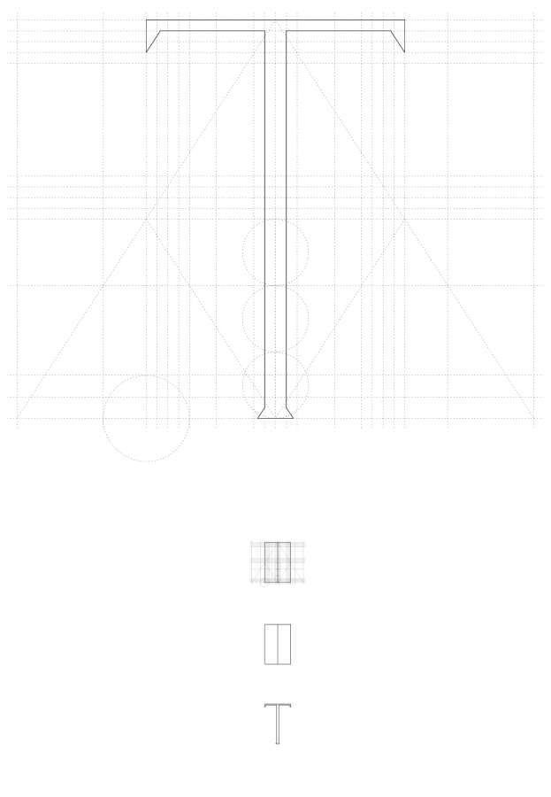
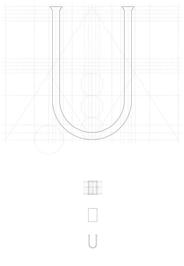
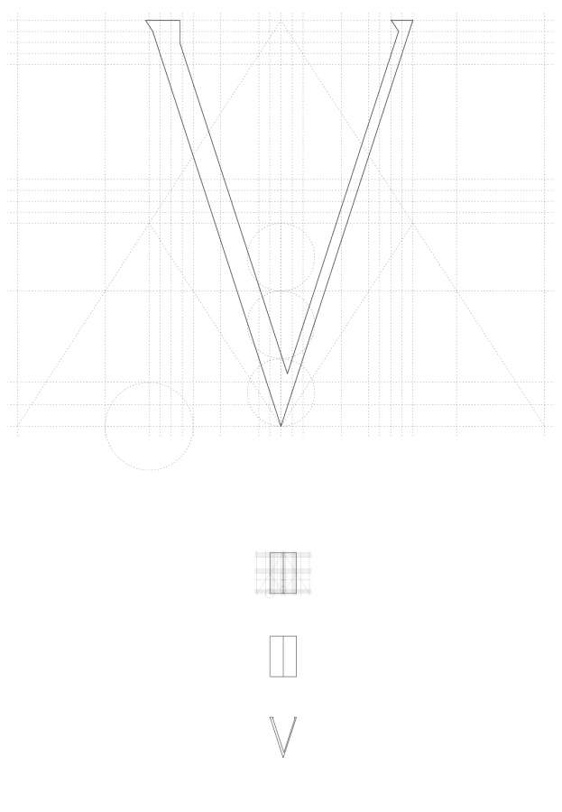
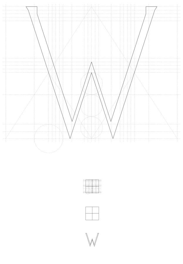
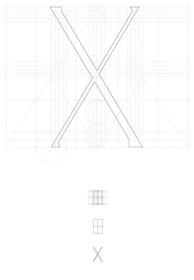
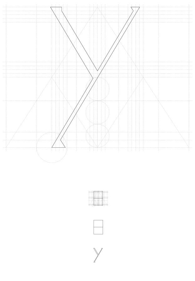
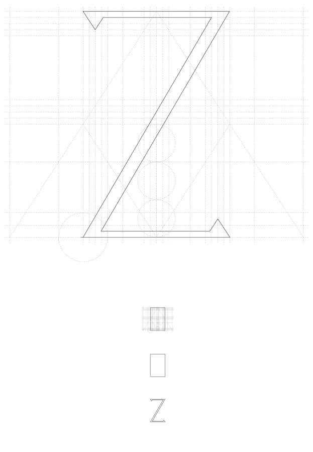
g02 - stone alphabet
stone alphabet for a fountain
2018
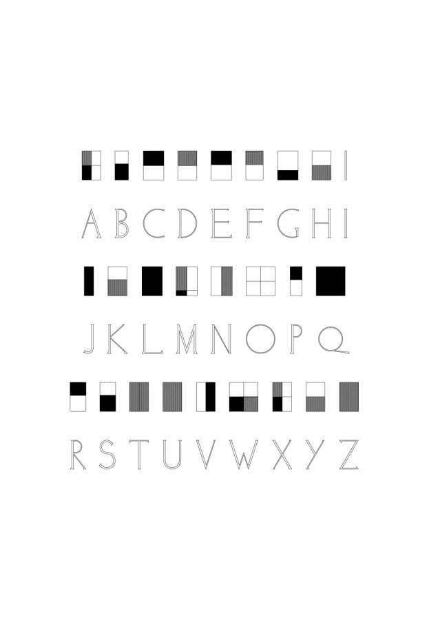
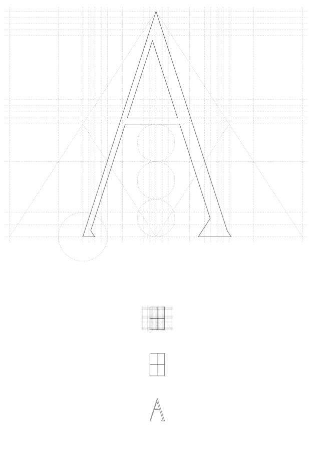
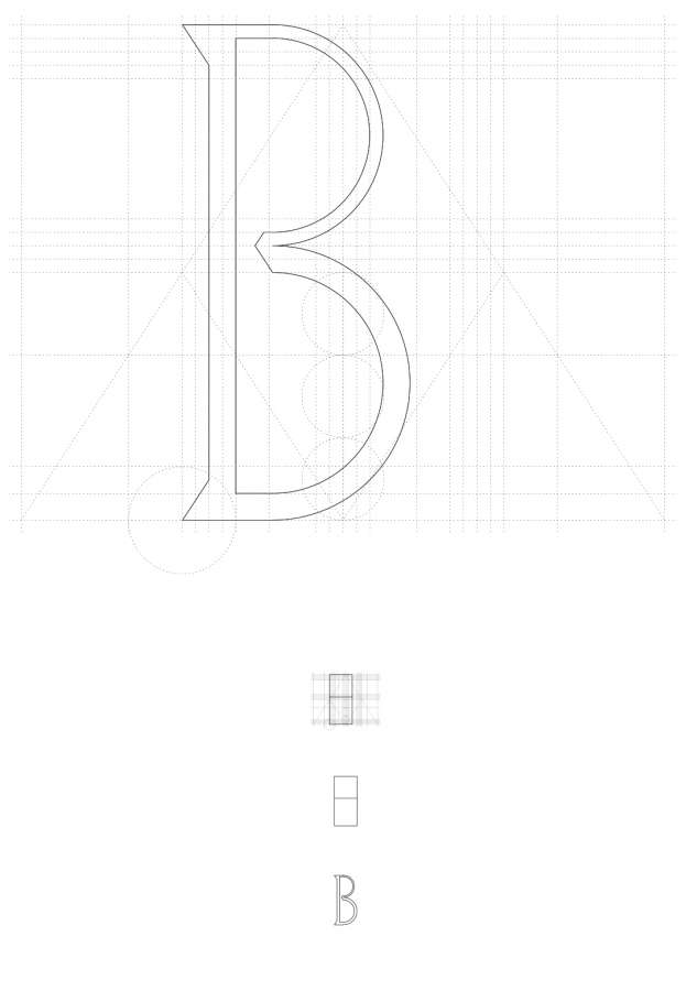
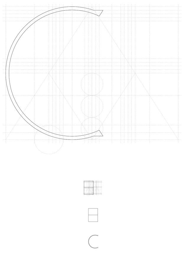
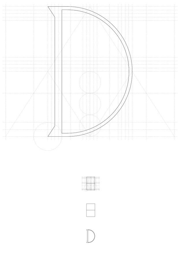
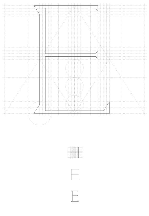
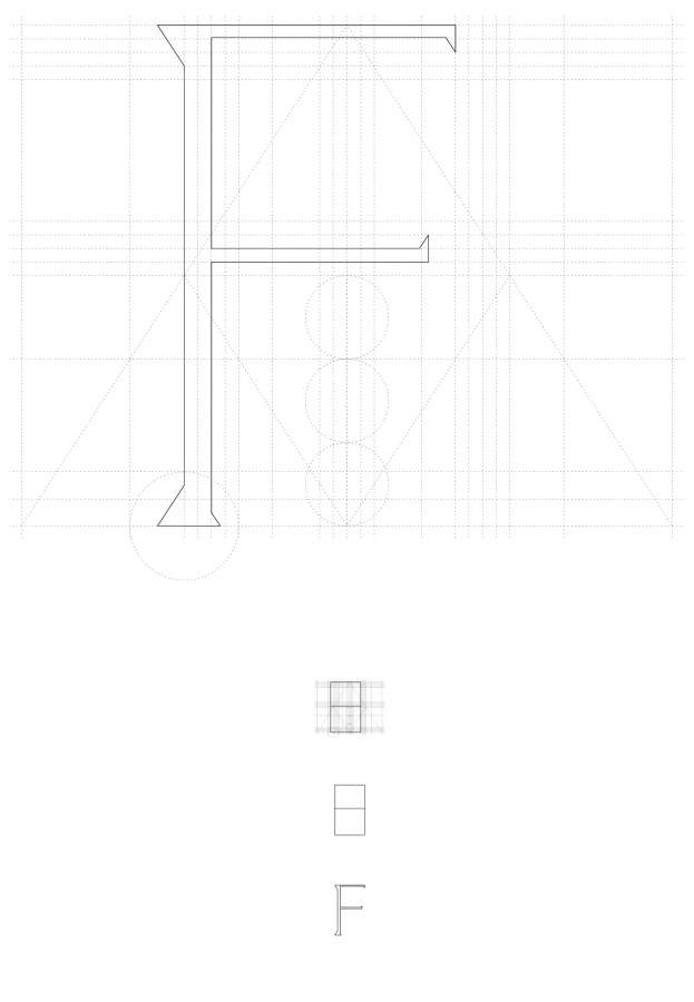
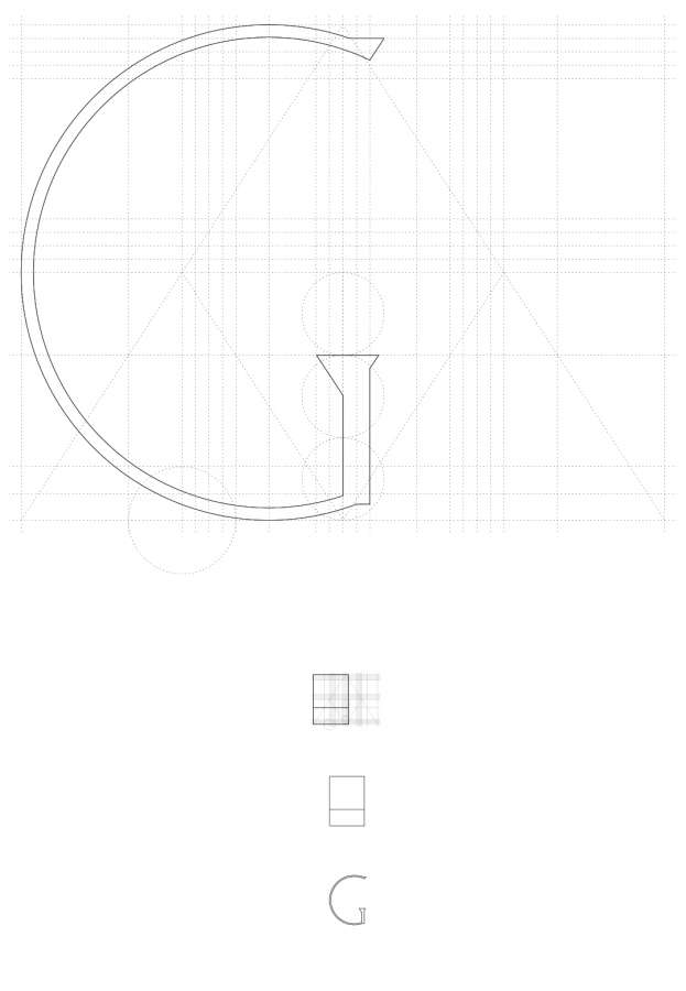
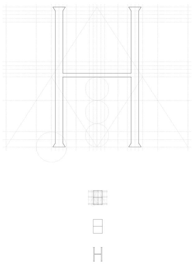
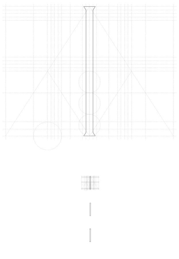
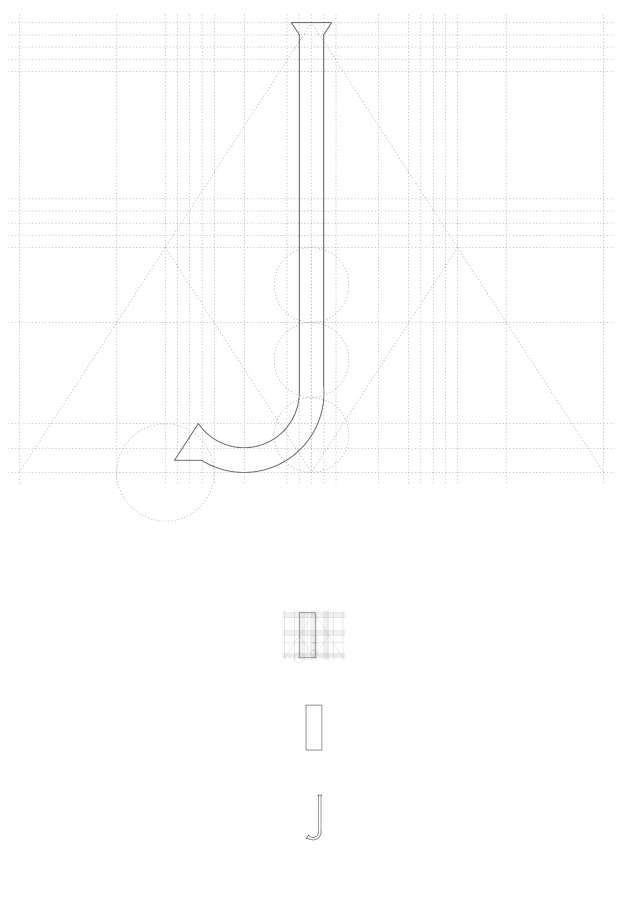
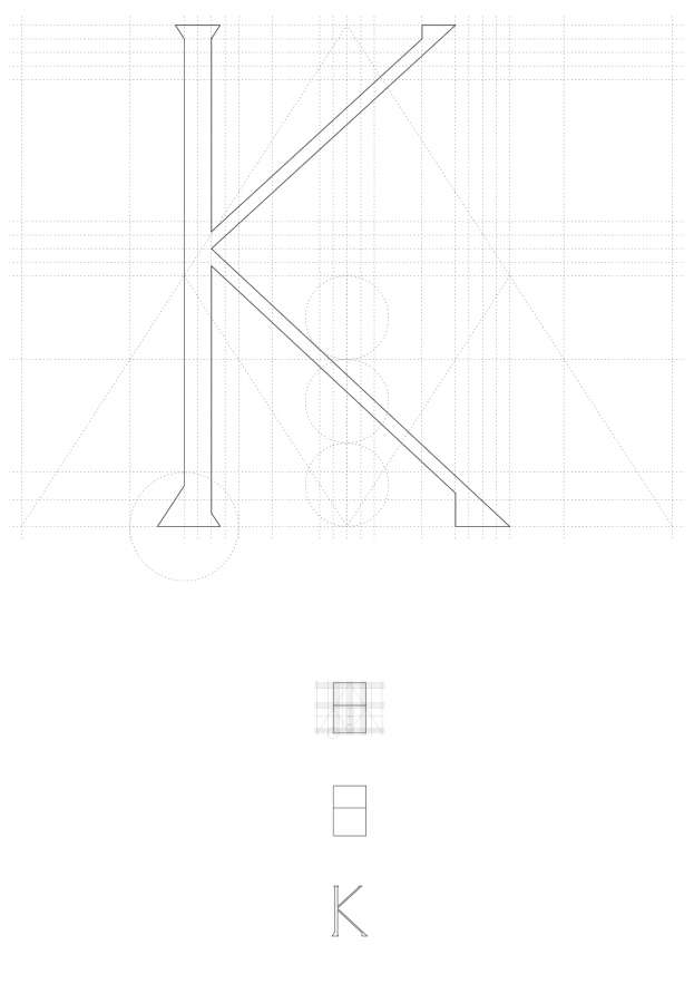
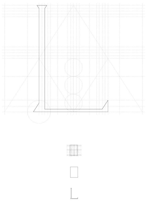
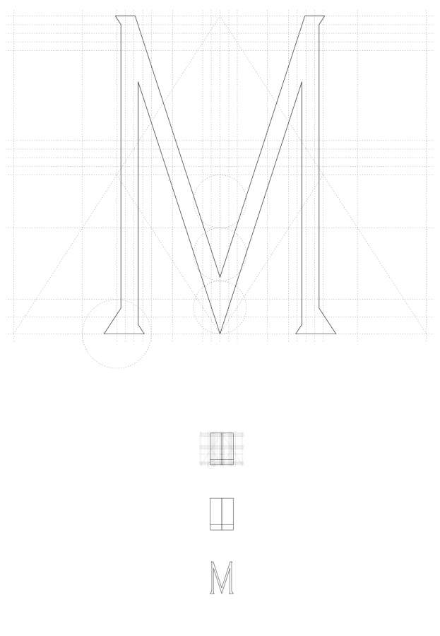
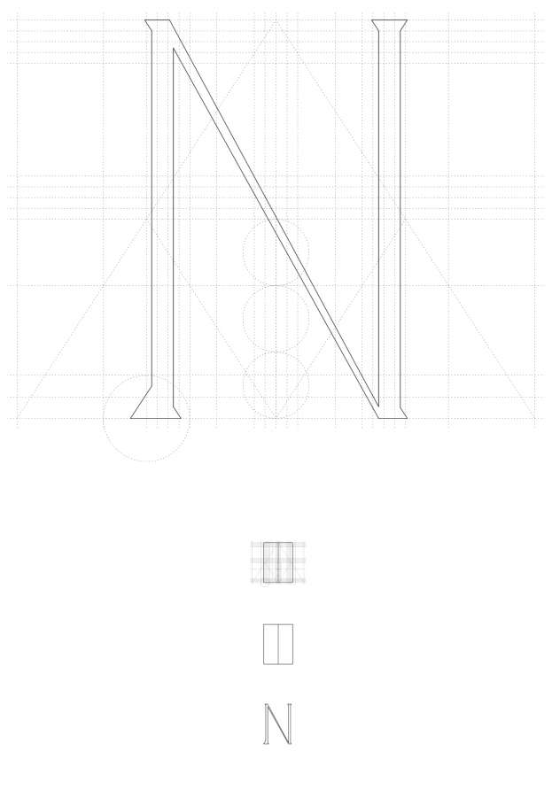
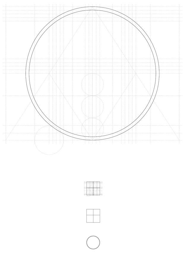
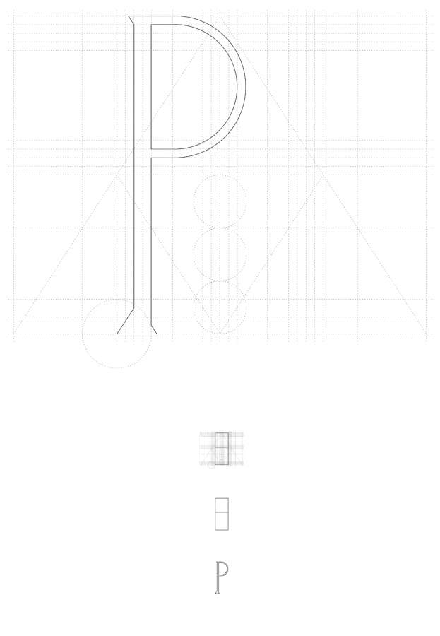
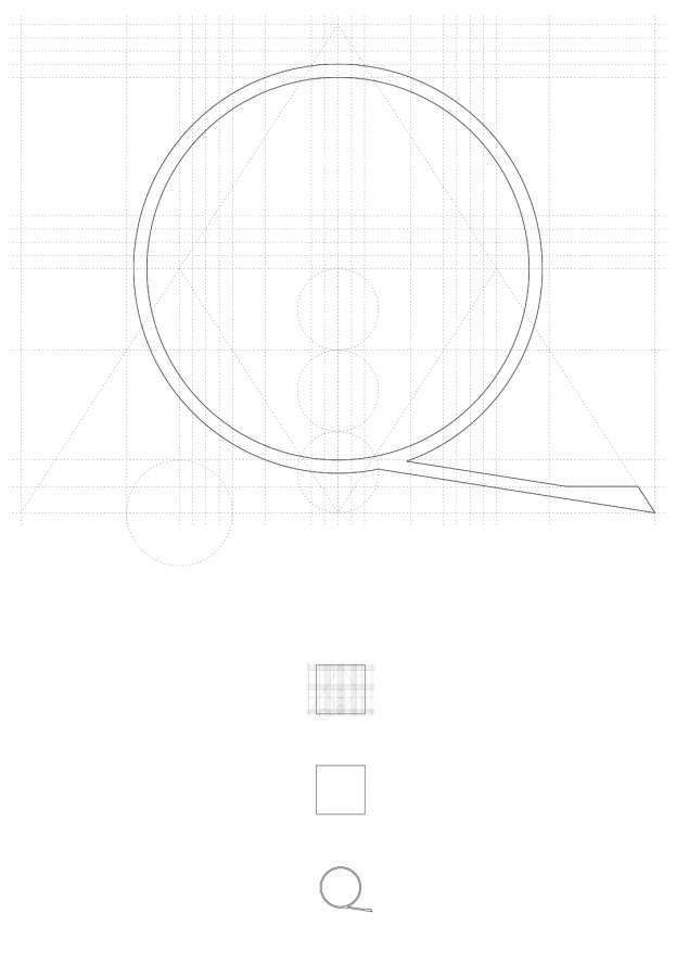
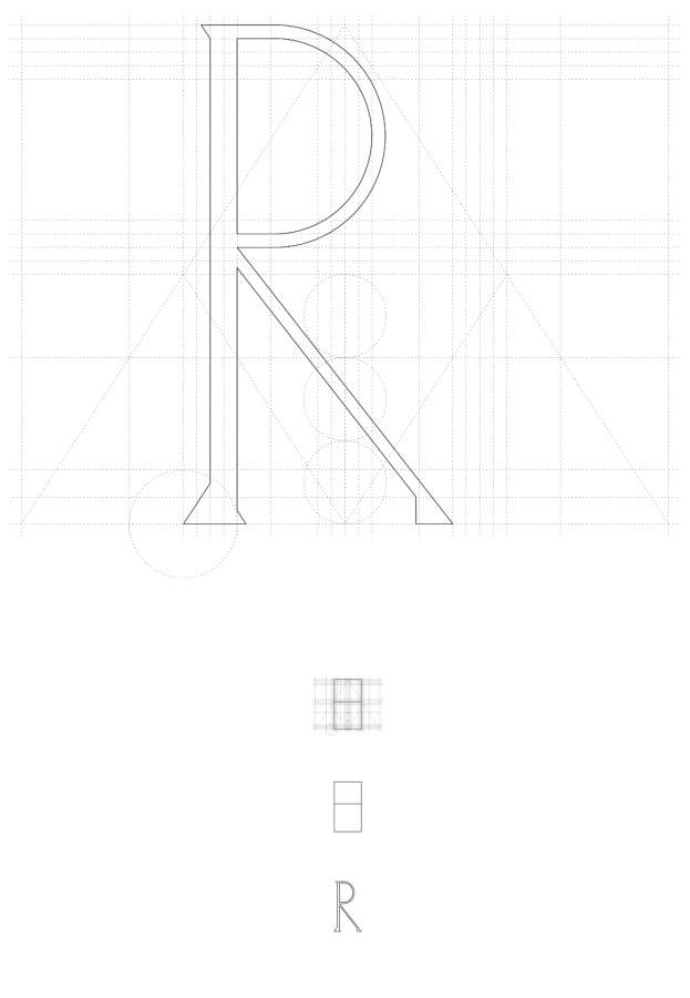
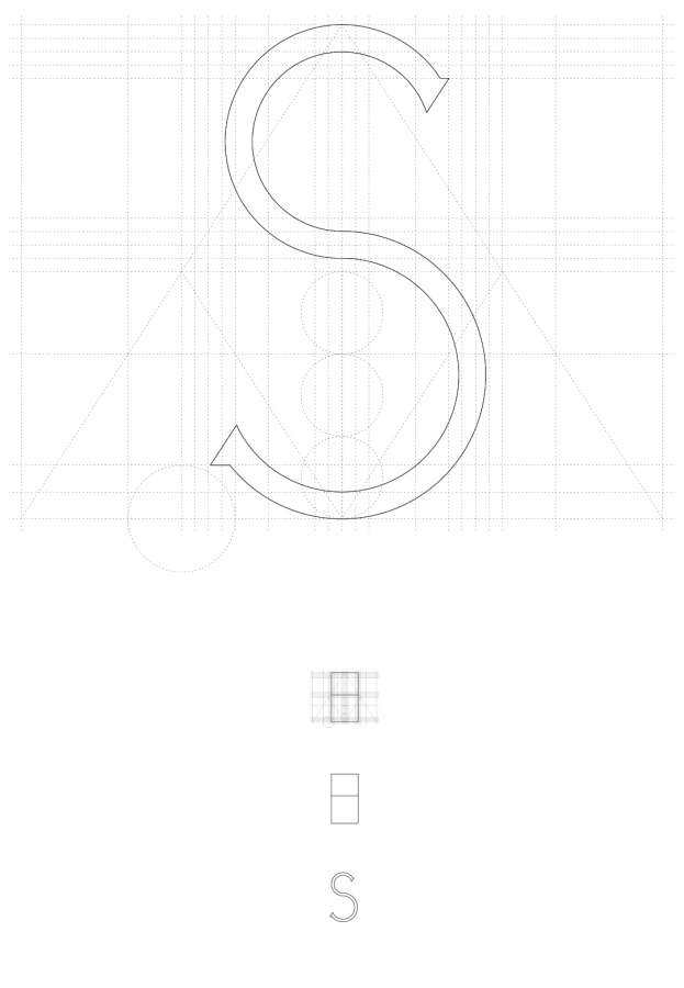
Dom Hans van der Laan created a typeface based on the Roman carved stone capitals that were used in the first century AD, declining the plastischgetal which was a reflection through numbers to find an harmony in the relations among things, either buildings, courts,typefaces.
The typeface is named Alfabet in steen .
We would like to honor the Flemish tradition reinterpreting the Alfabet in steen and a classical tradition which is rooted in the Italian Renaissance.
In scale 1 to 1 the type body would measure 50 mm, to invite a comfortable readability from distance.
The lenght of the lines would have a variable measure, between 40 and 60 characters counting both types and empty spaces, for a variable lenght of 80 and 120 centimeters.
